This Page is SUPER UGLY but I am learning about Flexbox, flex-containers & flex items

Don't worry, I know I am bad with aesthetics and color-choices. I am just working my way towards backend things

Below you can watch me playing with flexbox and auto margin

this one on the left side

and this one on the right side

these ones

on the left side

and this one on the right side

As you can see I haven't completely mastered the one below yet, the two elements that are supposed to rest on the right side only do so if we minimize the window

these ones

on the left side

and these ones

on the right side

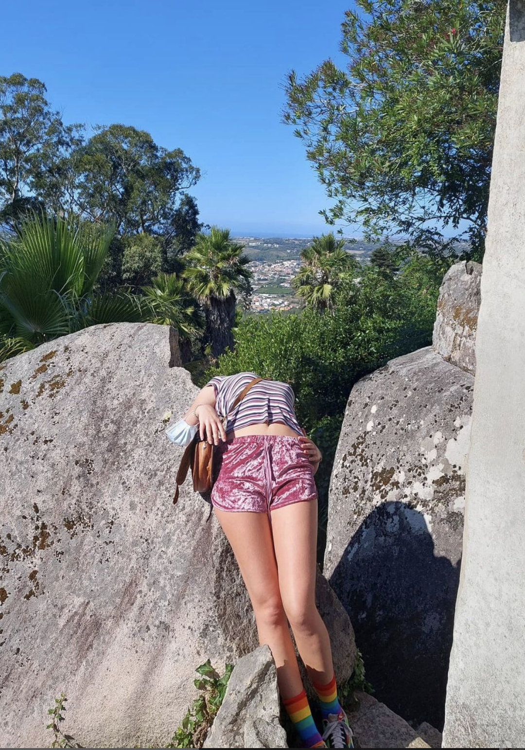
I like this picture of me melting into Sintra in Portugal but tbh flexbox is hard maybe this page is already too full and I have conflicting styles. ChatGPT says it's all fine but it feels like something's off or I have problem in my logic

With Flexbox, you can arrange items into rows or columns and make them grow or shrink ~~flex~~.

A cool thing about flex-containers is that you can make the elements adapt to the screen size

For

Example

These

Paragraph-Elements

So if you re-size your browser window, you'll see the elements above adapt in size. COOOL

Why? Because they are inside a flex-container class div element, which I've set the display to flex. And I defined that every P element in that class would be flex:1. And that's it.

Same for vertically arranged elements

These

Are

Stacked

Now

Want to have your mind blown? Every flex item can be a flex container in itself.

AMA

ZING

right?

Look at

these Examples

are they growing and

shrinking equally?

Nope, they aren't. Because their flex-growth item value is defined to 0.5 & 2, meaning that they will grow differently.

And these?

What's happening?

are they growing and

shrinking equally?

Nope, because the third element has the smallbro class defined which makes it smaller than the other 3.